I led a two-month initiative at GetGreen, a sustainability-focused platform, to design a cross-platform experience that extends beyond mobile.
Working as the sole designer alongside a small team of developers and product owners, I translated core product goals into a web-based component app aligned with the mobile experience. Through focused requirement gathering and strategic feature prioritization, I delivered a seamless, non-mobile interface that preserved usability, design consistency, and user intent—enabling individuals and organizations to take actionable steps toward sustainability, regardless of platform.
ROLE
UI Design, Wireframing, Prototyping, Usability Testing
TEAM
Product Owner, 3 Developers
DURATION
2 months
KEY RESULTS
MVP features shipped
users in the first 2 days
actions completed
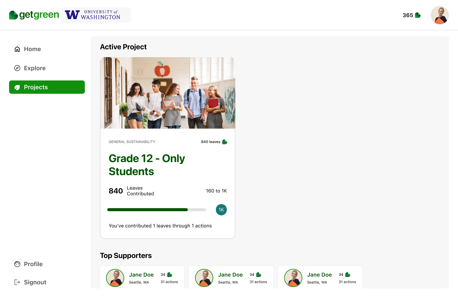
GetGreen is a sustainability platform that empowers individuals and organizations—such as cities, universities, and companies—to achieve their climate goals through everyday, actionable habits. The existing platform was a mobile app that allowed users to log in either individually or via enterprise-specific portals, enabling them to complete tasks that contribute to reducing their carbon footprint and combating climate change.
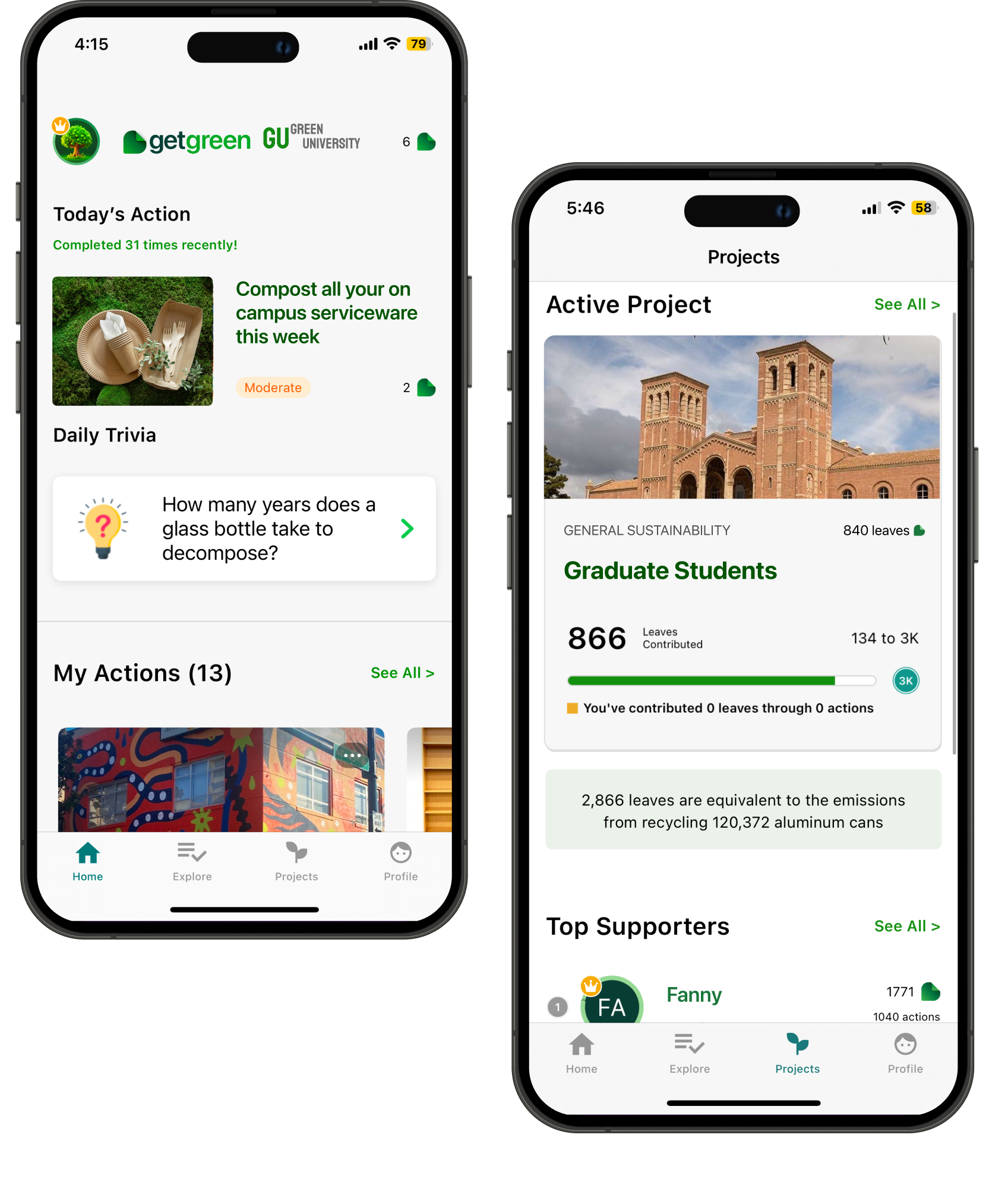
Current mobile app
To design a cross-platform experience that supports diverse usage contexts—such as offices, schools, and universities—while maintaining a consistent and intuitive user experience across devices.
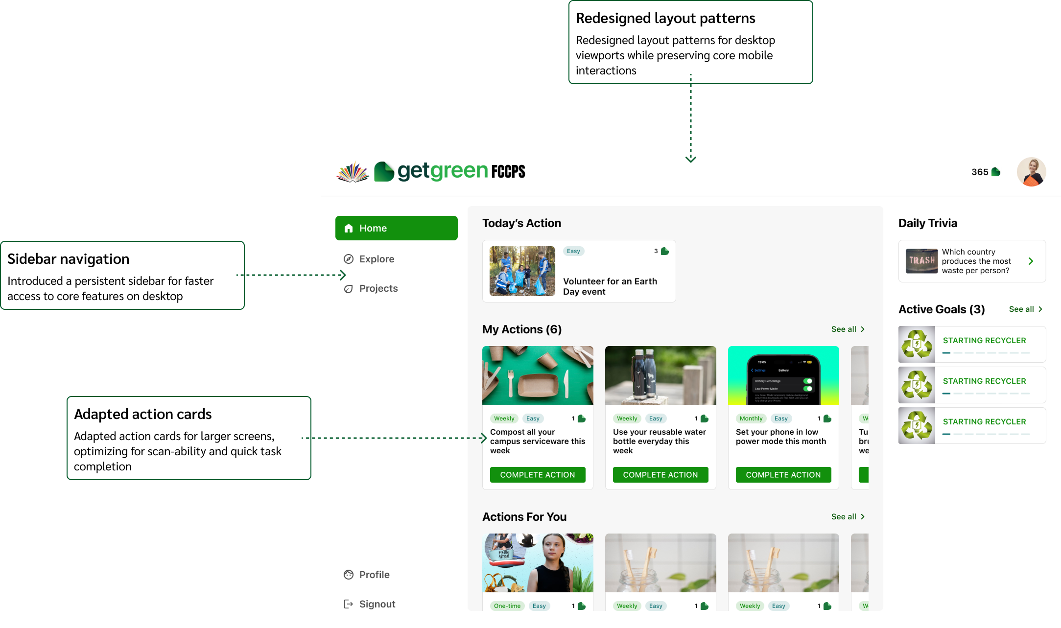
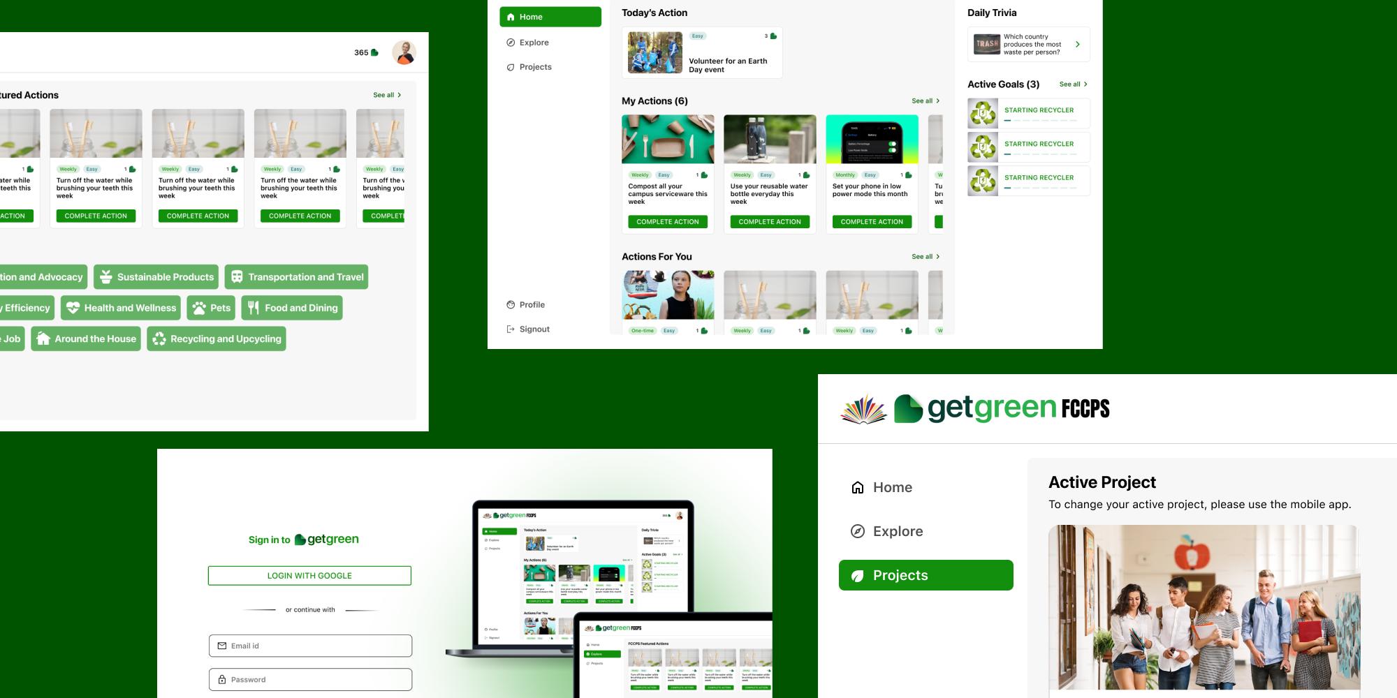
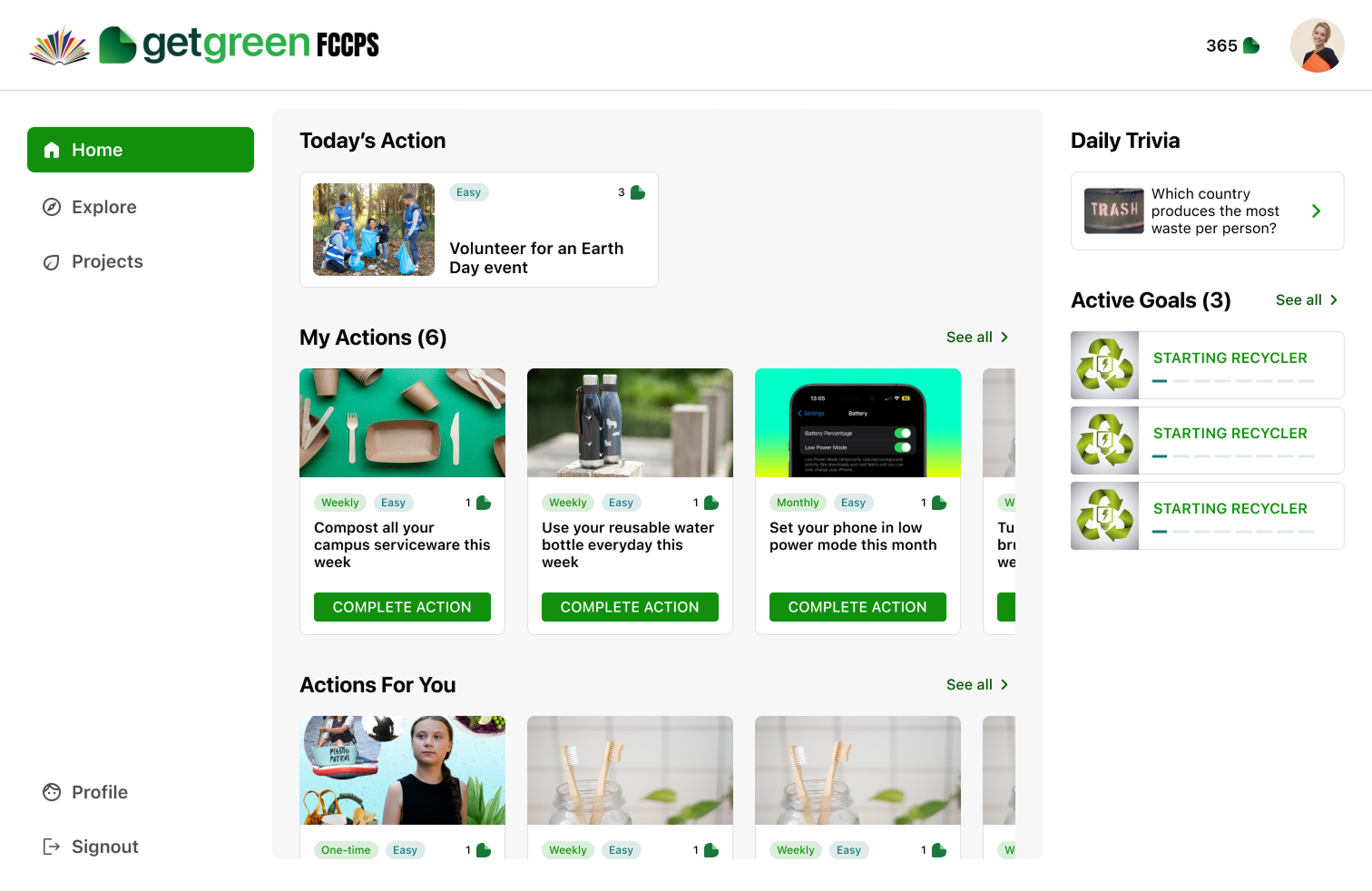
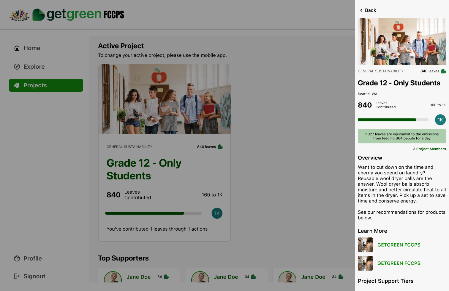
Final design of the desktop app (Home Screen)
1. Understand Requirements
2. MoSCoW analysis
3. Requirement Definition
1. Wireframing (Iteration 1)
2. Prototyping (Iteration 2)
3. Dev discussions
1. Internal Usability Testing
2. Product Owner Review
1. Final Prototyping
2. Handoff & Support
The process began with defining the MVP features for the web app using the MoSCoW method (Must-have, Should-have, Could-have, Won’t-have), in close collaboration with product owners and developers. We aligned on business goals, user needs, and key constraints.
✦ Drive user retention and cross-platform consistency
✦ Support B2B partnerships
✦ Expand market reach
✦ Enhance user experience
✦ Login & Sign Up (Email & Google)
✦ View actions and saved actions, browse categories, and complete actions
✦ View Active projects
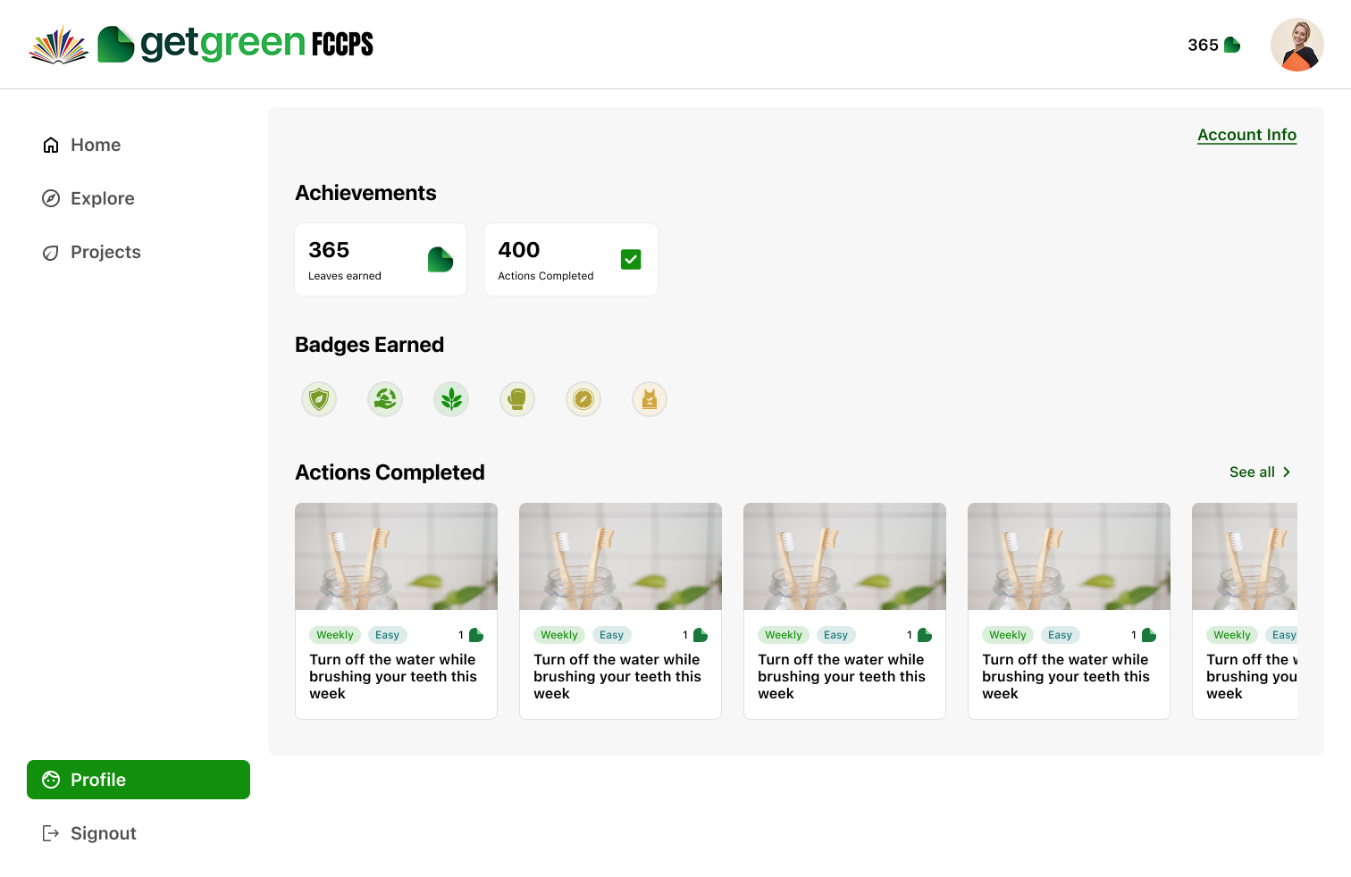
✦ View Profile
✦ Tight launch timeline
✦ Technical limitations of a new platform
✦ No time to test with actual users (internal testing only)
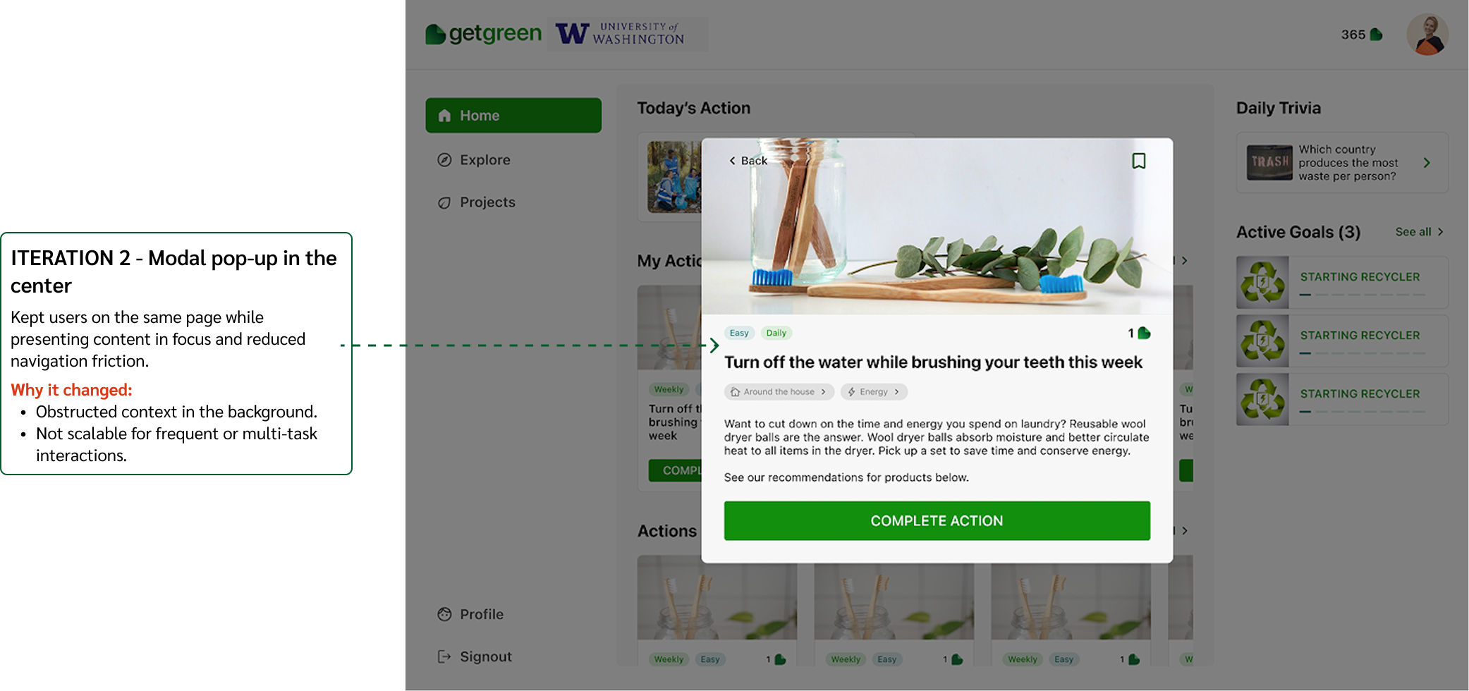
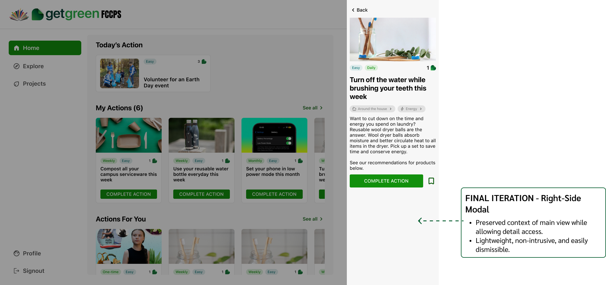
Decision #1
Decision #2
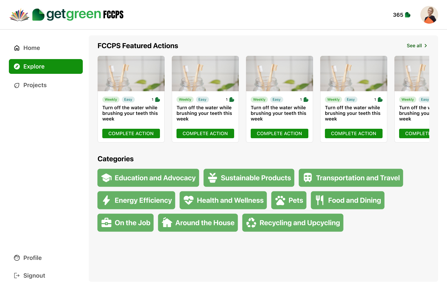
Projects represent groups within an organization that users can choose to join based on their interests. The leaves earned through individual actions contribute to the group’s overall goal. Users can browse available projects, join the ones they resonate with, and view leaderboards for each project.
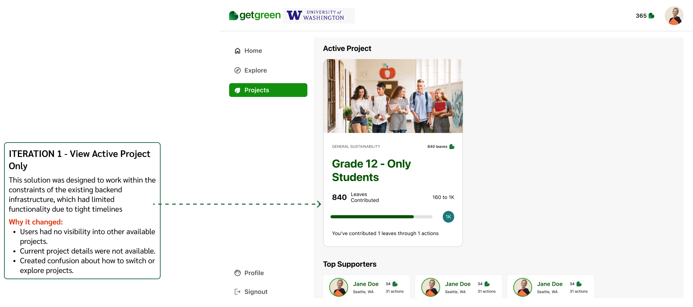
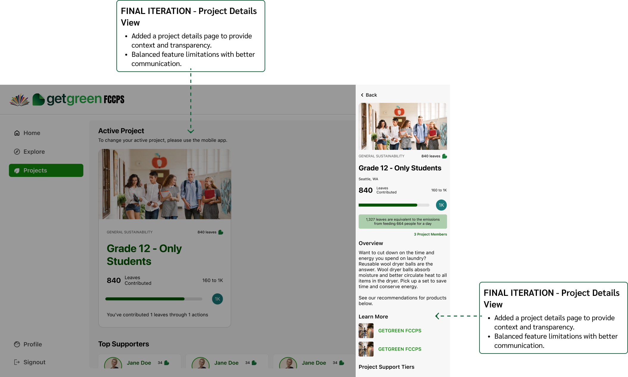
Decision #3
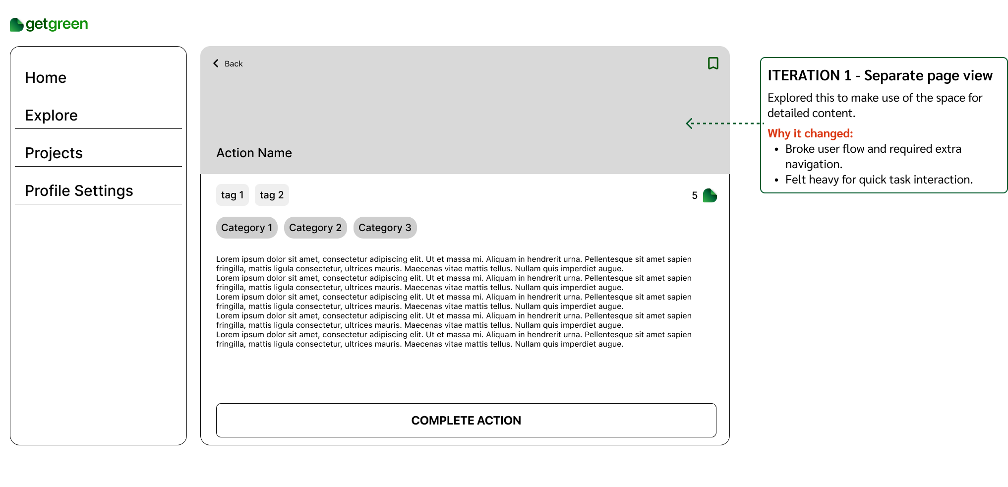
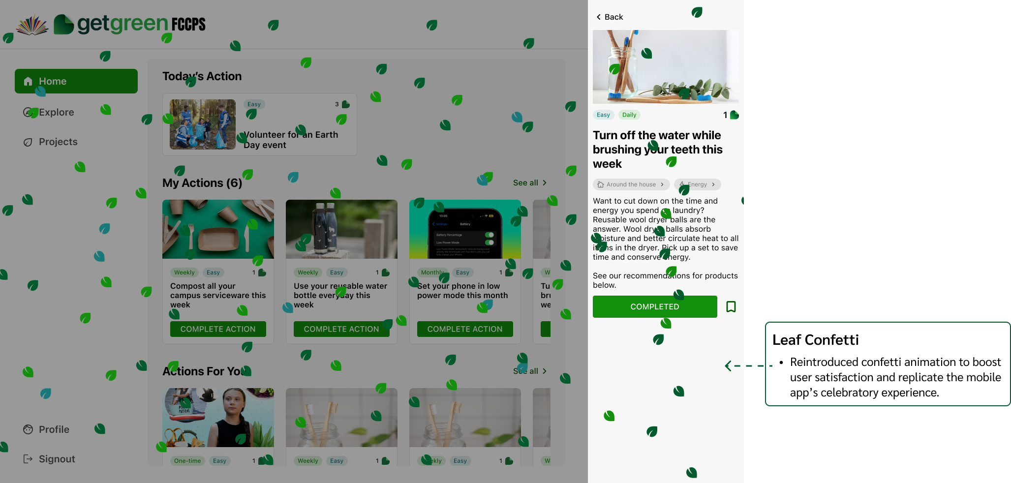
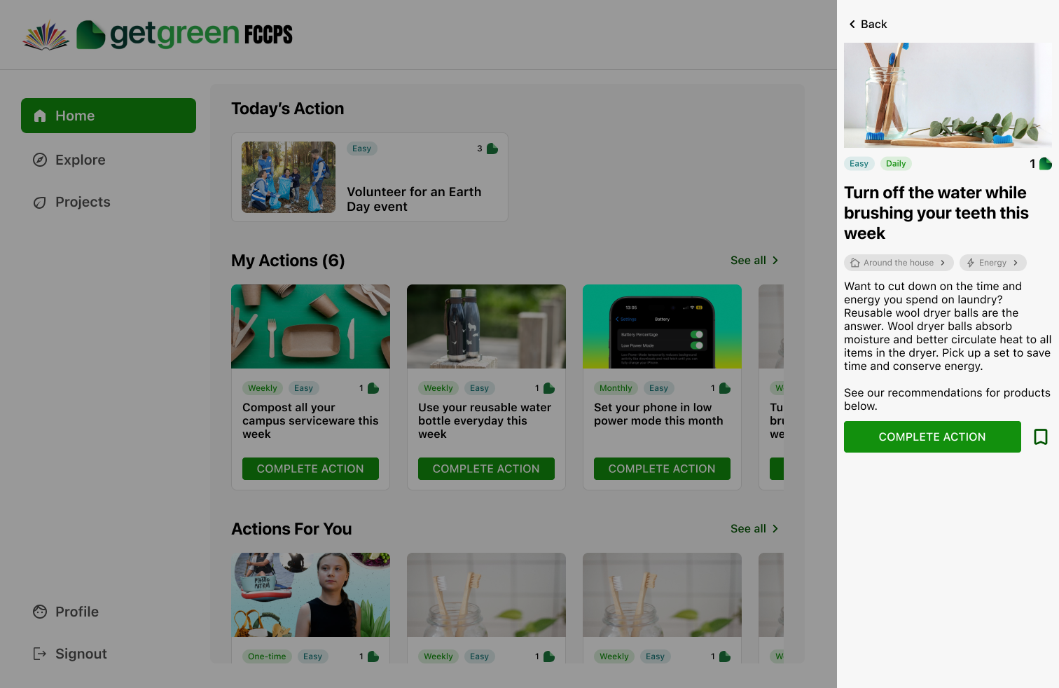
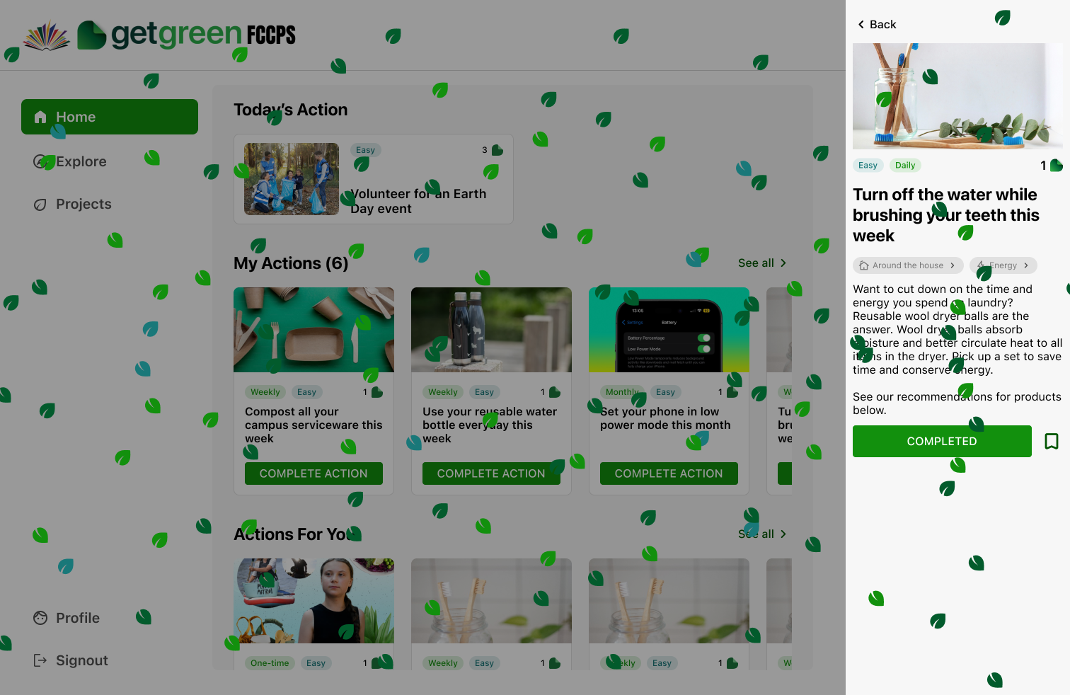
In the mobile app, a leaf confetti animation celebrates each completed action, reinforcing a sense of achievement. Due to technical complexity, this was excluded from the MVP. However, during internal testing, users expressed that they missed the animation, noting a drop in satisfaction and emotional engagement.
Goal #1
Goal #2
View actions
View action details
Complete action
Goal #2
Explore categories
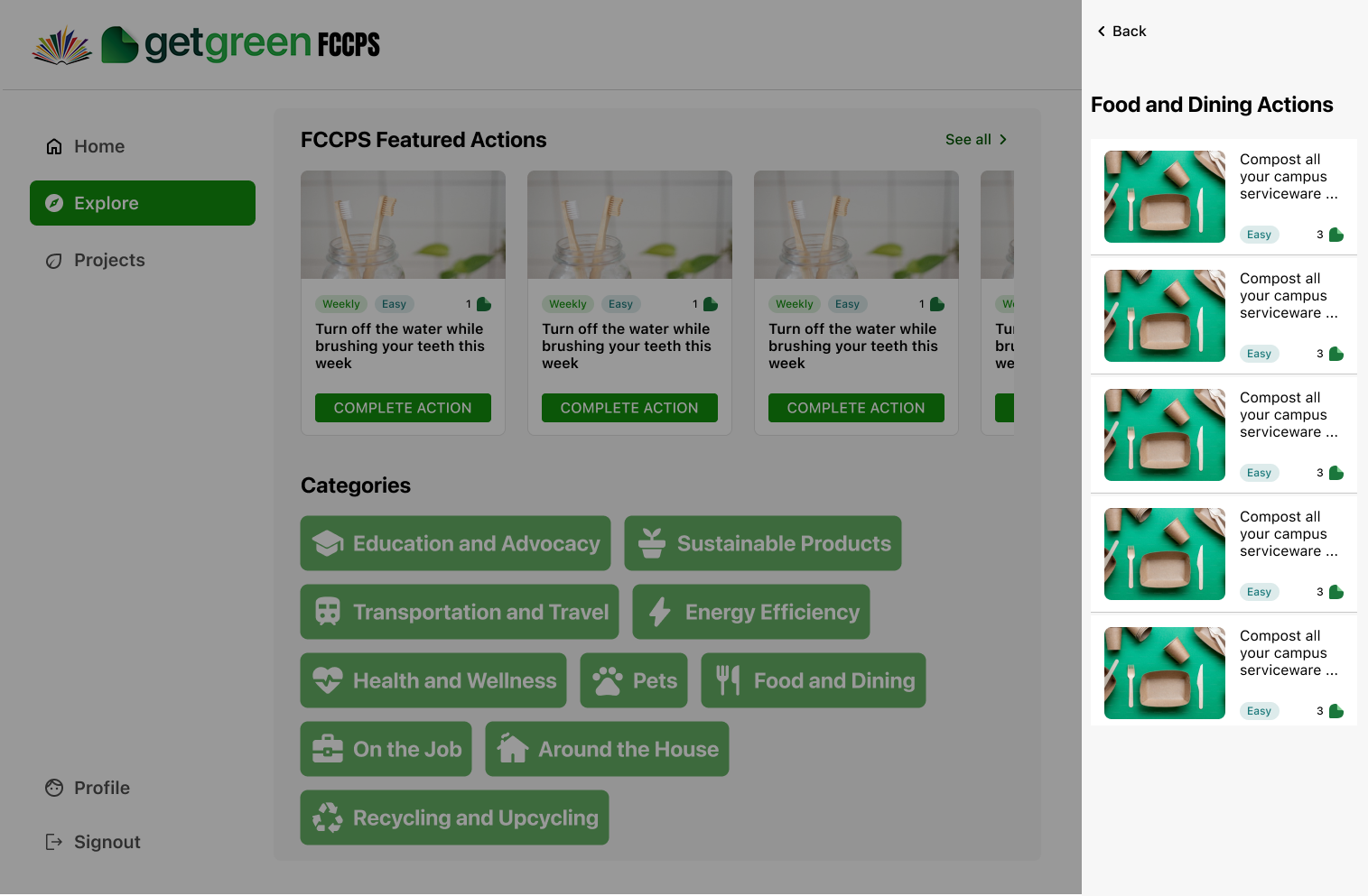
Category specific actions
Goal #3
Active project and leaderboard
Project details
Goal #4
The project successfully delivered a web-based MVP aligned with the mobile app, enabling non-mobile engagement in classrooms and offices. Key user needs were addressed through clear design decisions, and internal testing validated essential features, supporting a timely and focused launch.
Delivered a web experience aligned with the mobile app, supporting a seamless user journey.
Addressed a few of the usability issues in the mobile while balancing the cross-platform consistency
Shipped a functional MVP within tight deadlines while balancing usability and technical constraints.
MVP features shipped
users in the first 2 days
actions completed
Adapting mobile patterns to web taught me how to balance consistency with platform-specific needs like screen size, layout flexibility, and interaction models.
Using the MoSCoW framework helped me focus on delivering core functionality under time constraints, while aligning with both user and business priorities.
With no time for user research, I leaned on insights from the mobile app to inform decisions, ensuring continuity and relevance despite tight timelines.
Partnering closely with developers and product owners reinforced how strong communication helps navigate constraints and align solutions across teams.

Brewed with ☕ and 🦉 nights

